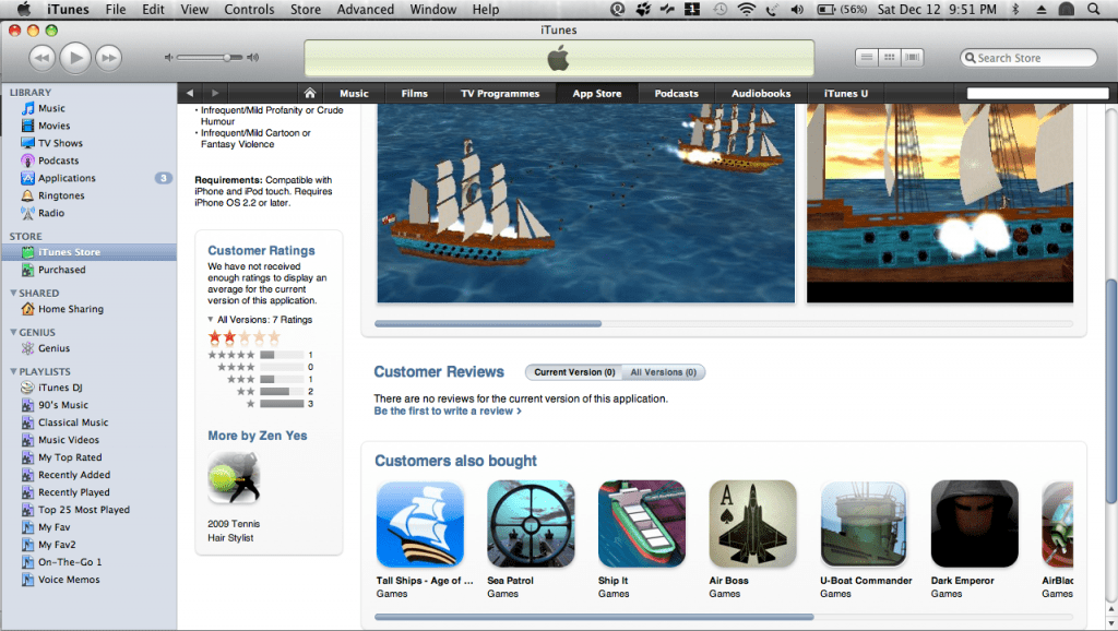
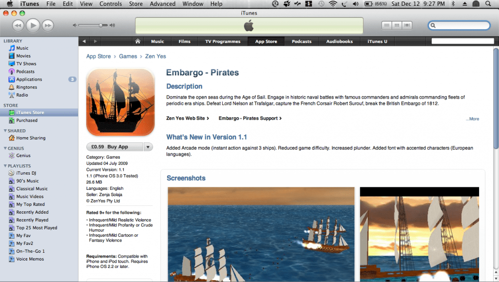
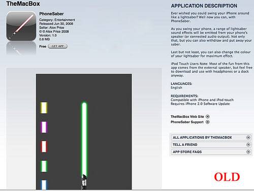
When I opened AppStore today, I was in for a surprise. Apple today has unveiled new look iTunes App Store;) There is no more the greyscale background, no app description on the right, no need to click to view the next screenshot of the app! The new layout now is of white background, scrollable app screen shots, app’s description on the top and its technical details like category/updated on/version/os tested/size/customer ratings on the left and like earlier customer reviews at the bottom. Clicking the “more” button can expand the app description and a new scrollable section at the bottom has app that “Customers also bought”.
Although this change by Apple is for good, I personally liked the earlier layout and not that excited about this new interface. Looks as Apple is giving more prominence to images than to text, a picture is worth a thousand words;) What do you feel?? head to comments section post your view!!


