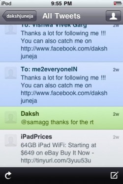
Echofon and Twitterfic are both award winning, official and widely used Twitter Third Party apps, but what happens when they are compared to each other for their iPhone apps.
Below are the way they fared amongst the following criterias:
Usability – Echofon is faster and easier with a bottom page feed which helps in moving on various sections like messages , mentions … Quicker. Twitterific has a colorful look and is also nice but you need a time match without which it does not update the latest tweets.
Interface – interface of Twitterific is more better to maneuver around various latest tweets. The Echofon has no such feature.
Color schemes – color schemes is available on Twitterfic , such as green background for own tweets, blue for new tweets and black for read tweets ; whereas Echofon has a simple grey background.
Fonts – Echofon has a option of increasing-decreasing font size from 12 – 15 pt. No such feature on Twitterific.
Additional features – detect link to Bit.ly (short URL), ping.fm (music) and Flickr (photo share) upload and syncing with Desktop few valuable features you will find with Echofon , Twitteriic on the other hand has many Picture upload options but nothing for short URL nor music. It also gives opion of video uploads.
GPS – Both are equally well in syncing latest tweets while on-the-go
Ads – being free apps both are not saved from showing Ads on the top bar, but Twitterific has an option of buying the premium app and getting rid of Ads
Multiple Accounts – Echofon allows multiple accounts sign Ins while Twiterrific allows it only in the paid (premium) app.
Price – both are free apps while Twitterific offers multiple accounts and Removal of ads from timeline.
Verdict – after using I find Echofon a much better and user friendly Twitter app than Twitterfic, you take the final call.
