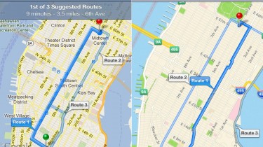
As the hype and media attention over the introduction of maps application in iOS6 settles in, we wonder how good it actually is.? Let us have a look at some of the features that are packed in with the new maps applications and all the while comparing it with the well known maps application they ditched, Google Maps.

Once opened, you can find that the application is completely redesigned with a new user interface and a new set of cartography. Apple partnered with TomTom to develop these new maps and they are really beautiful. Zooming in, you are gonna find some nice textures and areas like state parks. The text fonts are sharp on the roads and the font size remains the same, while building in the details as we zoom the map into the area looking at.
Coming to the 3D Flyover feature of these maps which is being talked about. It can be accessed by pulling up the page peel on the bottom right corner and choosing the option satellite. The space-satellite perspective in the maps is quite similar to that present in the satellite view of google maps. Hitting the 3D option on the bottom left hand corner, the satellite perspective shifts it to the bird-eye view. As we zoom in, the 3D buildings are generated which are amazingly detailed not just settling of rectangular boxes with antennas, which was a nice surprise. Apple seems to have mapped out these structures with detailed architectures, visible when we rotate around by using a new gesture “Two-finger rotate gesture”. When we use the gesture, the map is spun around (similar to a view when in a helicopter around the area). It isn’t just the skyscrapers, even the landscapes are mapped in amazing detail. For now, such detailing is available with the major cities of the world and they might take a bit of time to map out other areas as well.
Apple have also introduced the turn-by-turn navigation into this build of maps which works similar to google maps on iOS. The walk-by-foot directions are also offered. Where it differs from google maps is when we use the option of travel by public transit. When using the option of travel by public transit, the apple maps opens up a dialogue box listing out various public transit related apps. That’s a bummer as I like to have that option within the app itself. Also, the street-view which we accustomed to in google maps, providing the 360 degree view of the pinned location seems to be missing here. We could make use of the 3D flyover as an alternative, but it cannot replicate the assistance that the street view offered.
In conclusion, the present build of apple maps is quite admirable for the beautiful interface, 3D flyover. But, what lets it down a bit are the lack of public transit directions and street view which might be pacified with other features come the next build hopefully.
