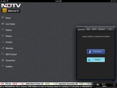
The NDTV application for iOS has remained on the top 10 free news category applications on App Store for months. Recently, their application for iPad has received a major update which changes the User Interface of the NDTV app. Similar to twitter application, it now has a UI of deck of cards where multiple windows are overlaid on one another. Also, you have an option to convert the window into full screen mode to read or watch a video conveniently.

If you have already used the native twitter application on iPad, you already know how to control the new User Interface. It’s more intuitive than ever. When you download the NDTV application on iPad, you would notice that the UI elements including the icon on home screen have been completely optimized for the retina display. All the categories such as News, Live Radio, Videos, Photos, Cricket, Markets, NDTV Social, Favourites and Soduko appears on the extreme left are static on their place.

It means that you can’t close them unlike their subcategories. These subcategories are in a table view which takes some part of the large screen of iPad. Just tap on any of these subcategories depending on what you want to read like top stories, Trending, Euro 2012, Recent, India, World, Business etc in the news category and you would have another window opened beside it. This windows is basically larger in width from the previous one. Now, again tap on any of the story you are interested in and it would be available for you on another windows just like deck of cards.

Noticeably, the last window could be converted into a full screen view to read the story for the convenience of the user. The various options provided to you on this window includes sharing options such as Facebook, Twitter and mail. In addition to it, you could favorite videos or stories and post comments right from the application. Just slide from left to right on a particular window to close it automatically. It’s as simple as that. However, as we told you earlier, the first one which defines the categories remains wherever it is.
On the bottom, you would notice the data from the stock market which is a moving text. However, you can’t move it fast or stop it with finger gestures. Beneath the stock notifier, we have a news banner to keep you updated with the news around the world. At the extreme bottom right, we have settings options that includes Accounts, Help, NDTV, Robosoft and T&C. On the top left, we have the option to watch the live TV immediately.
Verdict:
We think that Robosoft has done an amazing job by changing the UI of the application. We are so far liking the new changes which have occurred with this new version of the iPad application. This is complete package of news you have been looking for in an Indian App Store. If you haven’t tried it yet, we definitely recommend you to give it a shot now.
iTunes link
