Right since the day Realmac Software released its teaser of Clear app many iOS users went berserk over its beautiful, simple and clear UI. Now that the actual app is released on App Store we review it to let you know if its worth the hype and especially if its worth the 0.99$ you spend on it. Read along to know more about this beautiful gesture based app.
Clear is an app meant to manage your to-do lists. The app opens up with a simple set of options “My lists”, “Themes”, “Tips && Tricks” and “Settings”.
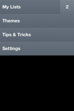
“My lists” manages all the to-do lists that you have. You can create any number of lists which in turn will contain all the to-do items you have in that list. So whats the catch here? Well the app as you can see from the screenshot has no dedication action buttons. All the actions will take place by some standard and unique gestures. To navigate into a list you just need to tap on the list name or to navigate into the next level of menu all you have to do is a fast swipe up on the screen.

To add a new list you can either tap in empty space, or swipe down in the list page. which gives you an option to add new list.
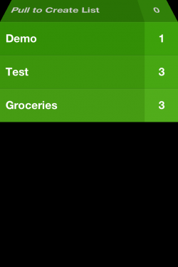
You can then assign a new name to the list which gets saved automatically.
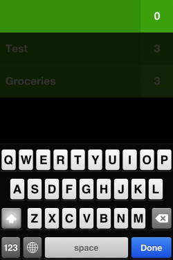
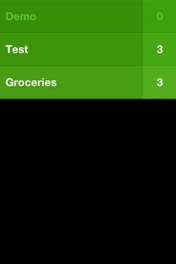
Each list can be either deleted or marked as completed. Swipe right to mark the list as complete and swipe lest to delete the list.
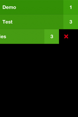
Tapping on a list will show you the to-dos you have in that particular list. As a list is empty when created the app shows some randomly generated quotes initially.

To create a new to-do all you have to do is either tap in empty space, or pull the to-do list down or pinch out in between two to-dos to inset a new to-do item in between the to-dos. You can even move the to-do item up and down the list. You have to tap and hold on a to-do list which pops it out first, then you can move it either up or down the list.

To mark a to-do as done you need to swipe the to-do item on to your right which marks it as completed. To delete a to-do item you need to swipe it left.

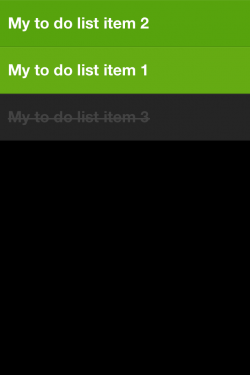
To move out to the previous layer the user need to pinch-in. Say pinch-in action in a to-do screen will take you to list screen and pinch-in action in list screen will take you to home screen.
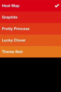
You are provided with options to chance the color scheme of the whole application which is provided in the “Themes” section. But only the “Heat Map” theme provided a gradient level coloring which is a bummer!
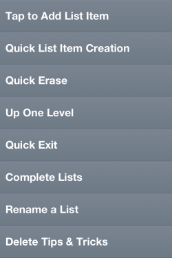
A simple “Tips & Tricks” deletable section provides you with a list of all gestures which are possible in the application.
Our view:
Well, so is the app worth the 0.99$ you spend on it? Yes, it definitely is. The simple and intuitive way it employs itself is worth it! The app brings in a new dimension of gestures which have every potential of becoming unofficial App Store standards like the swipe down to refresh gesture once did. But the app has its own set of limitations.
Clear is definitely not meant for power users. The very fact that you don’t have an option to add date or time to your to-do item is worth a reason! A simple limitation which restricts the user to 28 characters for each to-do item is another drawback. Clear cannot even sync the to-do list with iOS native to-do app or any other app, a simple option of backing up the to-do list would have helped at least which is clearly missing.
We had our own annoying bits of experience with the already implemented features as well. Pinching-out in between two to-do items to create a new one in between them is such a pain, especially on a small screen like iPhone. You either need to be a magical expert or use two hands to do it! The app does good in asking for confirmation while deleting a whole to-do list but it doesn’t ask you for any confirmation while deleting a to-do item.
With that said, most of these features aren’t out of reach. They can very well be expected in the next version of the app. But for all you iOS users out there, this app is a must try just to get a feel of the potential gesture based actions have.
PS: As noted on some other blog, the app managed to be no. 1 in paid apps section even though its meant for iOS 5 only. That shows the adaption rate of latest version of OS the iOS users have.
